Friday, August 12, 2011
New Location Design Exercise
It's been a little while since I posted last. This is not due to any lack of interest or subject matter, but a family illness that has almost completely consumed my mental attention.
Rest assured I have a cranium filled with relevant topics that I hope will benefit anyone out there interested in starting their own coffee shop.
What I've decided to do is to let all of you in on the exact details involved in the design and build out of my company's new location. The space was chosen after many failed attempts at securing lease that met the following criteria:
1. Affordable Rent
2. Minimum 10 years term
3. Geographically removed from our existing locations so as not to cannibalize sales
4. Located in what is to referred to as "downtown" in my city
5. A corner or equivalent location of high visibility and traffic
6. Existing interior features that would be attractive to customers
7. The possibility of fully operational windows to permit an indoor/outdoor feeling
8. A reputable landlord who cares for their buildings and chooses their tenants carefully
9. Minimum 800 square feet, maximum 1500 square feet.
10. Suitable masthead to accomodate visible outdoor signage
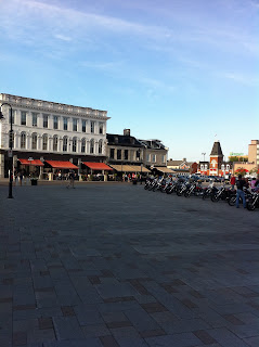
The space we chose is directly across from the oldest continually operating outdoor market in Canada, which serves as an outdoor skating rink in the winter. The square is also home to antique markets, concerts, outdoor movie nights, buskers, water fountain, Christmas tree in Winter and city provided free cafe tables. It is one block from the waterfront, and directly behind our historic City Hall which served as Canada's first capital. The location is not a corner, but the open space across the street permits broad visibility and prominence.
In addition to these features, the interior space has 14' ceilings, exposed brick on one wall, and exposed limestone on the other. The front of the building will be re-pointed this fall, and new operational windows and doors installed that meet strict historical standards enforced in our city.
I have included a JPEG of the layout of the raw space listed as "322" on the drawing, and am encouraging readers to copy the image and sketch out their own versions of what they think the space should look like. Each attempt should include 2 washrooms, seating for at least 20, a service counter (cash and espresso bar). The dividing wall between 318 and 322 is exposed red brick, and the angled wall is exposed limestone. The front windows swing in to open.
Have fun and please respond with your designs in the comments. Don't worry about doing anything overly technical, just draw on it, scan it, and submit it. I hope some of the submissions will spark interesting debate, and will ultimately end up in the finished drawings. As we progress I will produce an equipment list, and budget that will adhere as close to possible to my 50 Grand Business Plan. Impossible you say! Well let's see.
Subscribe to:
Post Comments (Atom)


The location is great. I think it really fits most of the criteria that was given. I think this is a good place for your business. Really nice!
ReplyDelete